
Title:
Hearing Test Data
Objective:
The objective of this data project was to use some simple US hearing test data to make a logistic regression classification model with Python.
Methods:
Python (Numpy, Pandas, Matplotlib, Seaborn), Logistic Regression, Descriptive Statistics
Explanation
This piece was part of an online course on machine learning and using a logistic regression for classification. I wanted to apply the knowledge that I had learnt with one of their data sets on passing a hearing test. The data contained the response variable Y, 0=failed the hearing test and 1=passed the hearing test, and my classification variables X1 and X2, Age (between 0 and 100) and Physical Health Score (between 0 and 50).
Building The Model
#Importing the libraries

import numpy as np
import pandas as pd
import matplotlib.pyplot as plt

#Read in the data

df = pd.read_csv(r'C:\\Users\\33776\\Desktop\\Python Course\\NOTEBOOKS\\DATA\\hearing_test.csv)

df.info

df.describe()
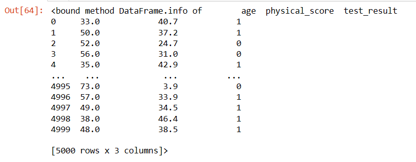
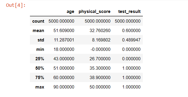
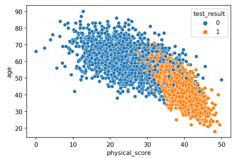
So, the initial results suggested a few things. No extreme outliers and no missing data, which is a good start. Next, when you use a scatterplot to plot Age vs Physical Score, there’s two clear trends:
- The older you are, the less likely you are to do well on the physical test.
- The better your physical score is, the better you’ll do at your hearing test.
#Data Exploration

plt.figure(dpi=150)
sns.scatterplot(data=df, x='phhysical_score', y='age', hue='test_result')
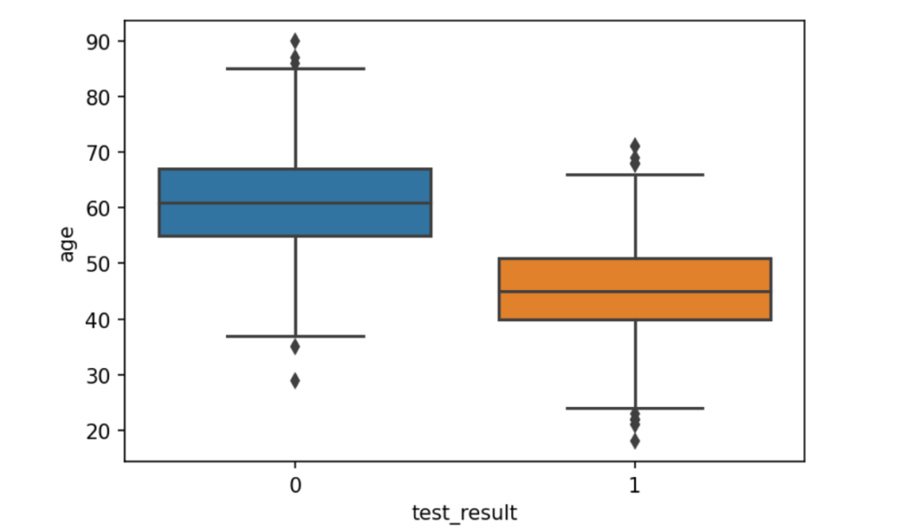
Next, I did a boxplot to see more accurately the differences between Age and Test Results, Physical Score and Test Results, and the distributions of both.
Clearly people who do not pass the hearing test tend to be older, according to the differences in the medians and the quartiles.
#Data Exploration

plt.figure(dpi=150)
sns.boxplot(data=df, x='test_result', y='age')
sns.boxplot(data=df, x='test_result', y='physical_score')
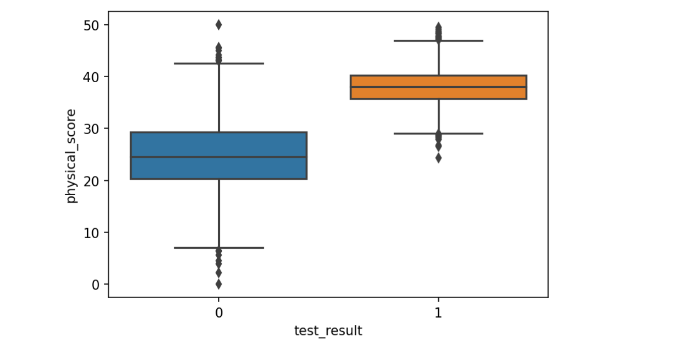
Now to use a common machine learning practice, ‘train-test-split’, which takes you’re training data and splits it into a training batch and testing batch – this is slightly different from the Kaggle competition I did for the Titanic data. I chose 30% of my data to be used as a test batch and the model was specified with a default 0.5 cut-off limit.
#Setting up the model with sklearn

x=df.drop('test_result',, axis=1)
y=df['test_result']
from sklearn.linear_model import LogisticRegression
log_model = LogisticRegresssion()
log_model.fit(x_train,y_train)

log_model.coef_

y_pred = log_model.predict(x_test)

The coefficient -0.08 means that as Age increases, there is less likelihood of someone passing the hearing test. The inverse is true with Physical Score, at 0.4, the likelihood of passing the hearing test increases as someone’s Physical Score increases.
The Results
#Getting the results

from sklearn.metrics import accuracy_score, confusion_matrix, classification_report
y_pred = log_model.predict(x_test)
accuracy_score(y_test,y_pred)
confusion_matrix(y_test,y_pred)
print(classification_report(y_test,y_pred))

from sklear.metrics import precision_score,recall_score
precision_score(y_test,y_pred)
recall_score(y_test,y_pred)
Now, it was time to have a look at the results. In terms of classification, I was going to use the Confusion Matrix, Accuracy Score, Precision Score, Recall Score, F1 Score and the ROC curve (Receiver Operator Characteristic).
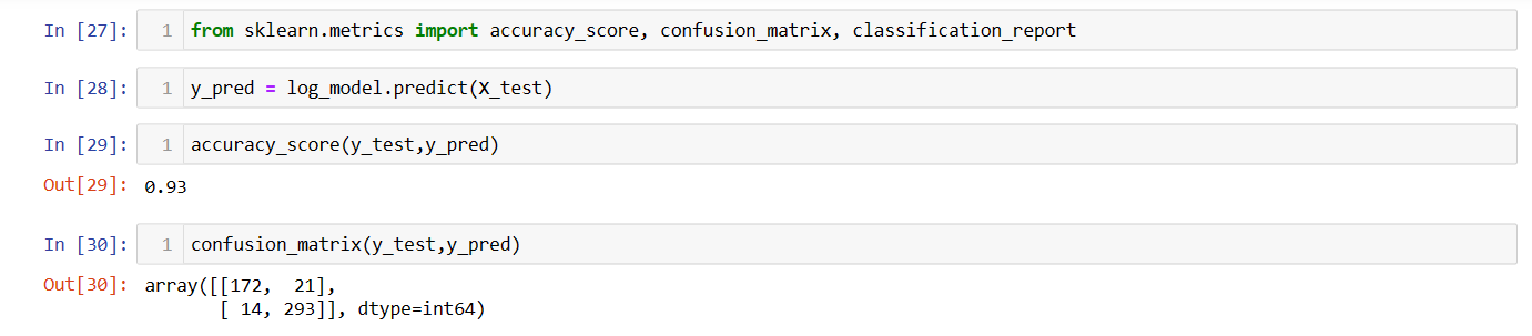
The Confusion Matrix shows:
- True Positives: 172
- False Positives: 14
- False Negatives: 21
- True Negatives: 293
Drawn from this is the most straightforward indicator of classification:
Accuracy: the ratio of the number of correct True Positives and True Negatives over the Total number of Predictions (or observations). However, it’s not the best metric because of the accuracy paradox.
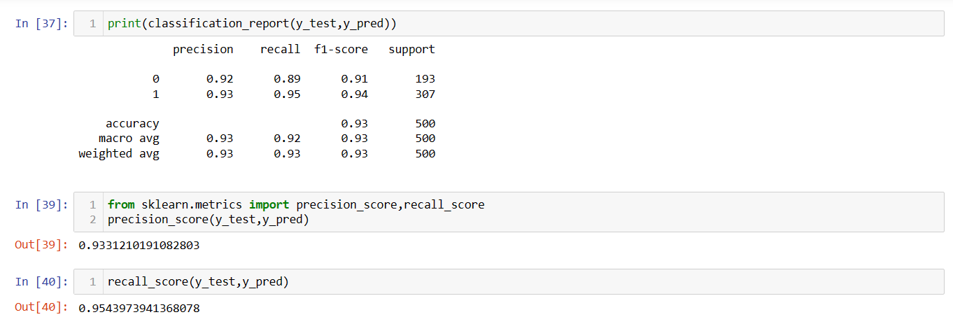
The Precision Score answers the question ‘when the model prediction gives a positive result (positive result = 1), how often is it correct?’ It is made up of True Positives/Total Predicted Positives.
The Recall Score answers the question ‘when there is an actual true positive case in the data, how often is the model correctly identifying it?’ It is made up of the True Positives/Total Actual Positives. This metric alerts you to when the model is overfit/always predicting the majority class. Below, you can see those scores for each variable and the overall score.
As the Precision and Recall Score are related to each other, we use the F1 Score (the harmonic mean of Precision and Recall). It represents how well the model is doing in terms of Recall and Precision in one number. Below is the F1 Score for both variables.
If your Recall, Precision and Accuracy Score are close together in value, the data is well balanced.
#Getting the ROC plot

fig,ax=plt.subplots(figsize=(12,8))
plot_roc_curve(log_model,scaled_x_test,y_test, ax=ax)
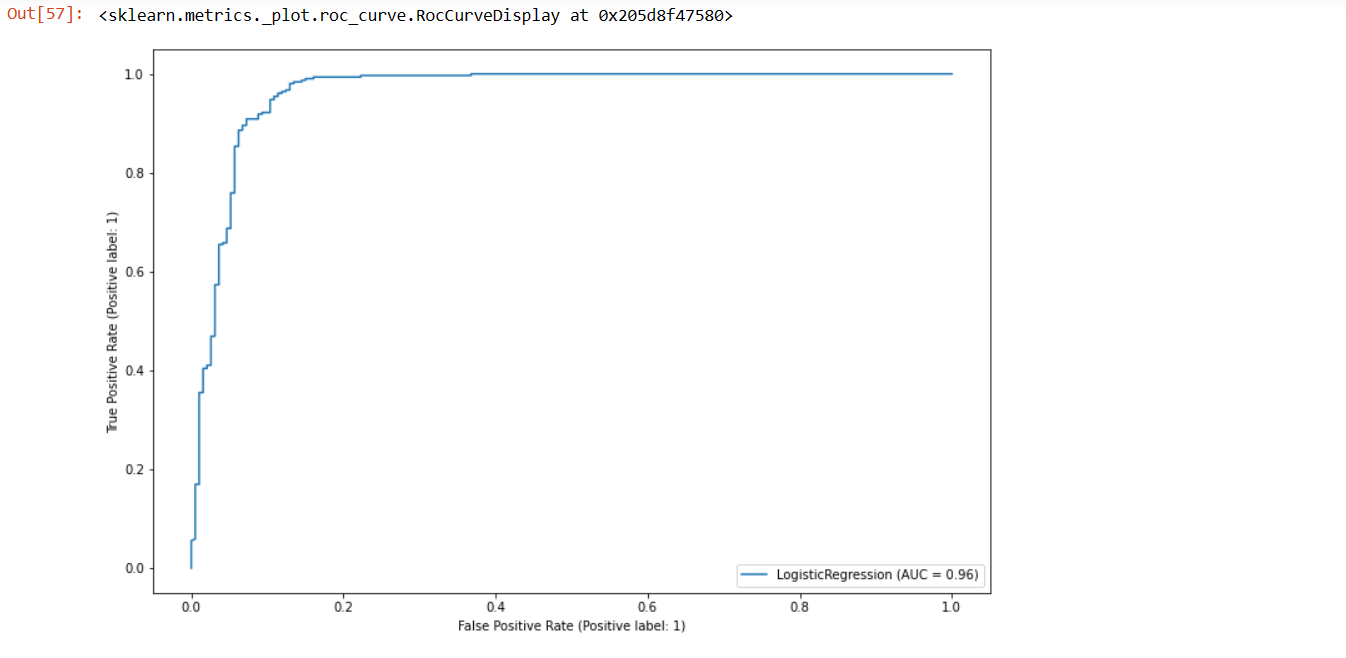
In the ROC curve above, imagine a straight line from bottom left to top right corner, this represents the predictions of a random guess. The further away the curve is to the left, the more accurate the model predictions are, where the perfect score has no False Positives at all. The ROC curve is created by plotting pairs of the true positive rate vs. the false positive rate for every possible decision threshold of the logistic regression model. To quantify this further, the AUC, ‘Area Under the Curve’, allows you to compare ROC with different scores and models. From the looks of all the metrics, this model is actually pretty strong and pretty accurate, based on the data.