Title:
Creating a ‘Dot Plot’.
Objective:
As a Data and Reporting Analyst, I am often asked by the country missions to analyse data and create bespoke visualisations for their reports.
Methods:
Python (Matplotlib, Seaborn), Data Visualisation
Explanation
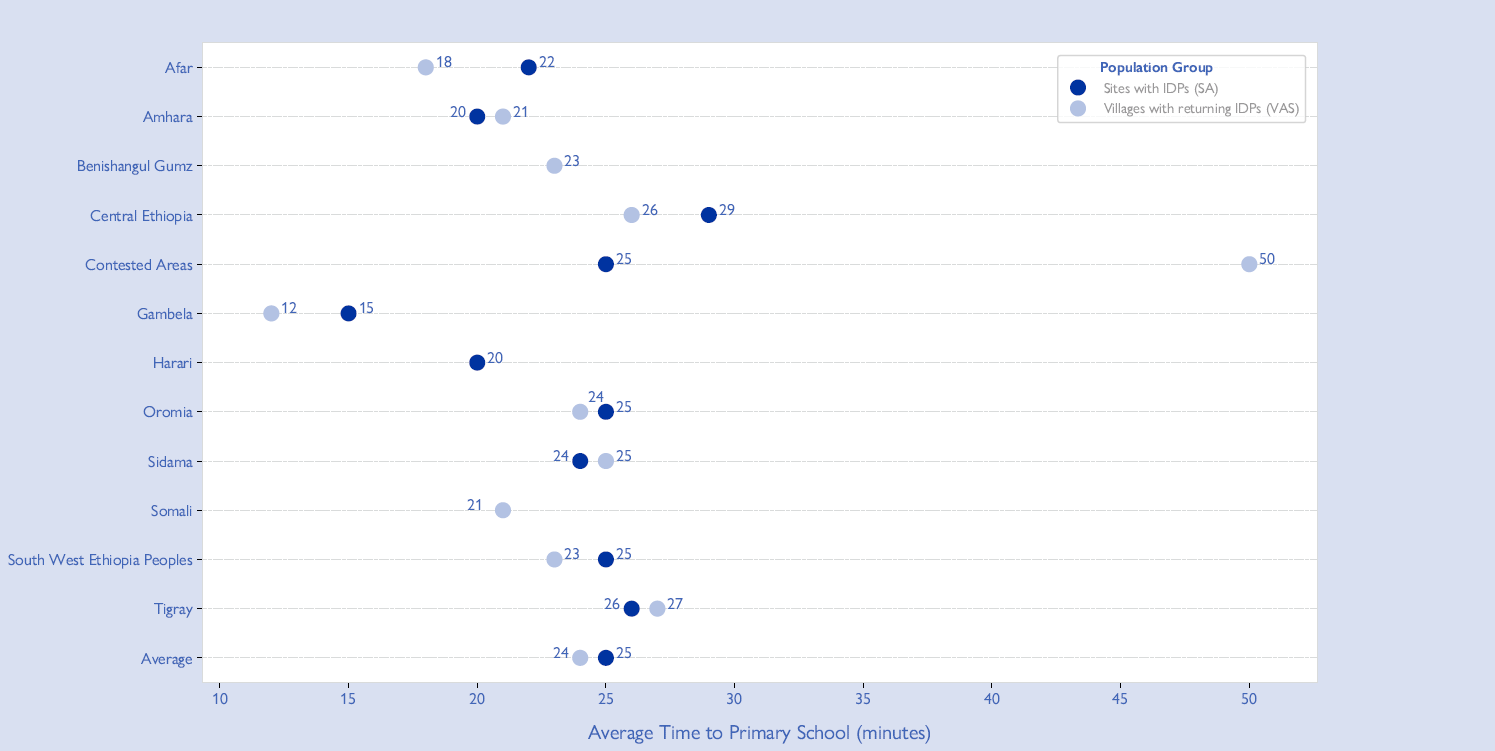
One of the more challenging but enjoyable parts of my work at the IOM is creating bespoke visualisations for country missions. On this occasion, I was asked to create a ‘Dot Plot’, a wonderful graph that allows you to show how data points are spread across a range and can be used very effectively in time series analysis or comparisons across different categorical variables. Below, you can see one of a series I made for IOM Ethiopia. You can see the plots in the full report here.
Below is the plot, slightly adjusted for publication, alongside other visualisations that I did for the report and code blocks with how I created the first version of the plot.
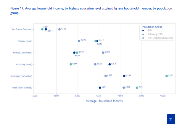
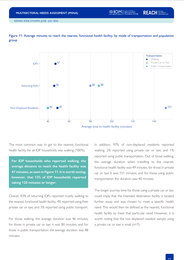
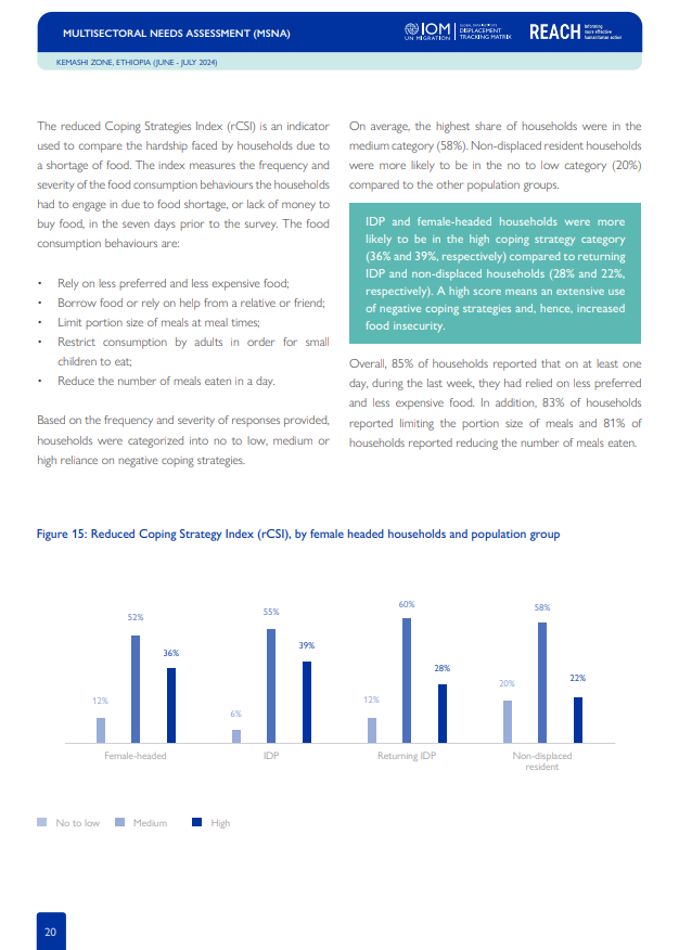
Let's begin by setting libraries, fonts and some customisations
#Importing the libraries

import numpy as np
import pandas as pd
import matplotlib.pyplot as plt
import seaborn as sns
import matplotlib.font_manager as fm
import matplotlib.gridspec as gridspec

#Creating custom formatting and fonts

custom_font_path = r'C:\Users\miredale\ - removed for privacy reasons -\5.- Gill Sans Nova Book 5.otf'
custom_font = fm.FontProperties(fname=custom_font_path)
custom_font_path2 = r'C:\Users\miredale\Downloads\GillSansNova-SemiBold.otf'
custom_font2 = fm.FontProperties(fname=custom_font_path2)

#Create customisations for the plot

region_order = ['Afar', 'Amhara', 'Benishangul Gumz', 'Central Ethiopia', 'Contested Areas', 'Gambela', 'Harari', 'Oromia', 'Sidama', 'Somali', 'South West Ethiopia Peoples','Tigray', 'Average']
custom_palette = {'Sites with IDPs (SA)': '#0033a0', 'Villages with returning IDPs (VAS)': '#b3c2e3'}
Building the plot itself and the plot area
#Building the plot

fig = plt.figure(figsize=(16, 8))
gs = gridspec.GridSpec(1, 2, width_ratios=[20, 1])
ax = fig.add_subplot(gs[0])
sns.stripplot(data=EduDot,
              x="Average Time to Walk to Primary School (minutes)",
              y="Region",
              hue="Analysis",
              marker='o',
              palette=custom_palette,
              size=11,
              jitter=False,
              alpha=1,
              order=region_order,
              ax=ax)


#Formatting the plot area and the x/y axes

ax.margins(x=0.07)
fig.patch.set_facecolor('#e6effb')
ax.set_xticklabels(ax.get_xticklabels(), fontproperties=custom_font, fontsize=14, weight='bold', color='#4066b8')
ax.set_yticklabels(ax.get_yticklabels(), fontproperties=custom_font, fontsize=14, weight='bold', color='#4066b8')


ax.spines['top'].set_color('#d9dbdb')
ax.spines['bottom'].set_color('#d9dbdb')
ax.spines['left'].set_color('#d9dbdb')
ax.spines['right'].set_color('#d9dbdb')


ax.grid(True, axis='y', color='#d9dbdb', linestyle='--', linewidth=0.7)
yticks = ax.get_yticks()
yticklabels = [tick.get_text() for tick in ax.get_yticklabels()]
This was an interesting piece of code that I had learnt about in order to adjust the positions of the dots
#Adjusting the positions for the estimates for the 'dots'.

x_offsets = [0.4, -1.05, 0.4, 0.4, 0.4, 0.4, 0.4, -1.05, 0.4, -1.05, 0.4, 0.4, 0.4, 0.4, 0.4, 0.4, 0.4, 0.3, 0.4, -1.4, 0.4, 0.4, -1.05]
# Custom x-offset for each label

y_offsets = [0,0,0,0,0,0,0,0,0, 0, 0, 0,0, 0, 0, 0, 0, -0.2, 0, 0, 0,0,0]   # Custom y-offset for each label
#            1,2,3,4,5,6,7,8,9,10, 11,12,13,14,15,16,17,18,19,20,21,22,23 - position of each label on the grid relative to its offset

#Check to see if my dot offsets match the length of my data
assert len(x_offsets) == len(EduDot), "Ensure custom offset lists match data size."
Creating the labels for the dots
#This loop iterates over each row of EduDot and gets the x_position, which corresponds to the value 'Average Time to Walk to Primary School (minutes)' at index i. Also, it extracts the region from the EduDot['Region'] column at index i, finds the index of that region in yticklabels and retrieves the corresponding y_position.


for i in range(len(EduDot)):
    x_position = EduDot['Average Time to Walk to Primary School (minutes)'].iloc[i]
    y_position = yticks[yticklabels.index(EduDot['Region'].iloc[i])]

# Use custom offsets for x and y
    x_offset = x_offsets[i]
    y_offset = y_offsets[i]
    plt.text(
        x_position + x_offset,
        y_position + y_offset,
        str(x_position),
        fontproperties=custom_font,
        horizontalalignment='left',
        size=11,
        color='#4066b8',
        weight='bold')
Labels and Legends
#Handling the design of the labels and legend

plt.gcf().set_facecolor('#d9e0f1')

ax.set_facecolor('#FFFFFF')
ax.set_xticklabels(ax.get_xticklabels(), fontproperties=custom_font, fontsize=11, weight='bold', color='#4066b8')
ax.set_yticklabels(ax.get_yticklabels(), fontproperties=custom_font, fontsize=11, weight='bold', color='#4066b8')

plt.title(' ', color='#4066b8', fontproperties=custom_font, fontsize=16, pad=12)
plt.xlabel('Average Time to Primary School (minutes)', color='#4066b8', fontproperties=custom_font, fontsize=14, labelpad=12)
plt.ylabel('', color='#4066b8', fontproperties=custom_font, fontsize=16, labelpad=12)

legend=plt.legend(title='Population Group            ', prop=custom_font, title_fontproperties=custom_font2, bbox_to_anchor=(0.989, 0.98), loc='upper right', borderaxespad=0.)
legend.get_title().set_color('#4066b8')

for text in legend.get_texts():
    text.set_color('#9a999a')
fig.add_subplot(gs[1]).axis('off')
Final output
#Export the figure

plt.savefig(r"C:\Users\miredale\OneDrive - International Organization for Migration - IOM\ - removed for privacy -\SchoolDot2.pdf", format="pdf", bbox_inches='tight')
plt.show()
The Result